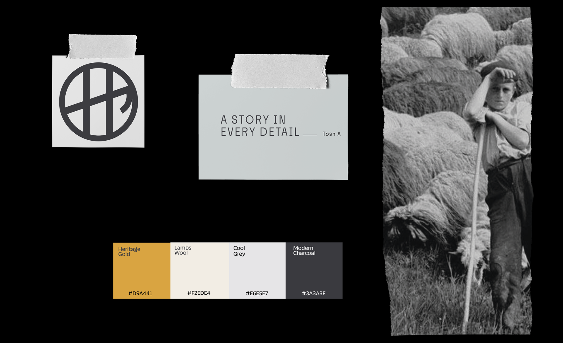

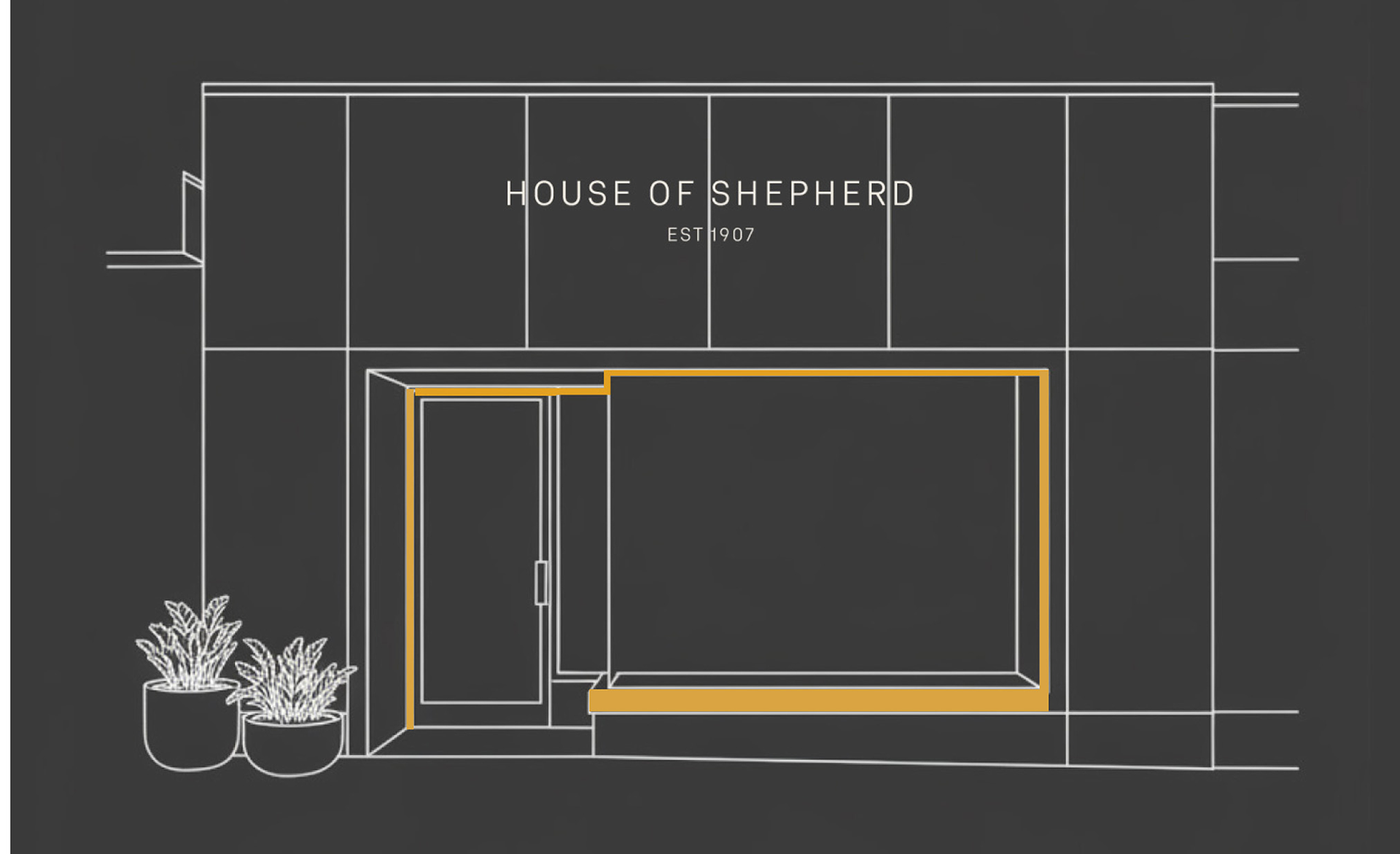
The logo evolved from combining the initials H and S into a form inspired by a shepherd’s crook, shaping the H. This mark was then refined and sharpened to align with the precision of the wordmark.
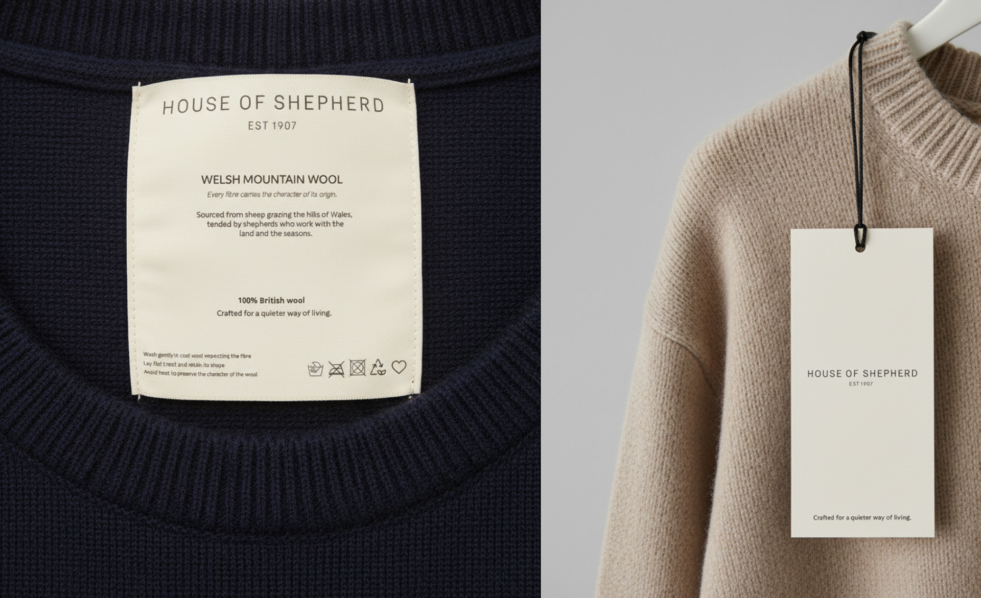
Designed as an emblem, it allows the identity to extend seamlessly across garments.
Designed as an emblem, it allows the identity to extend seamlessly across garments.
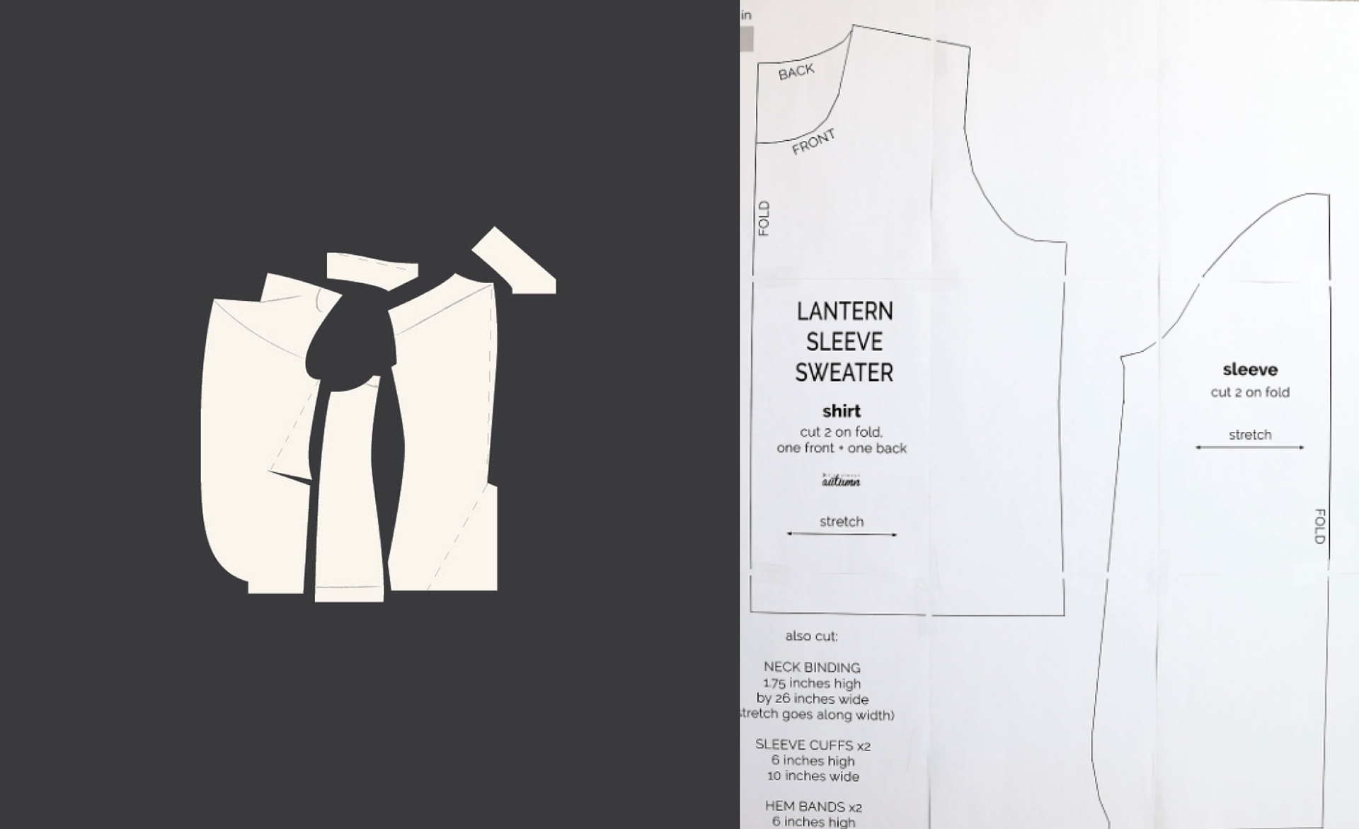
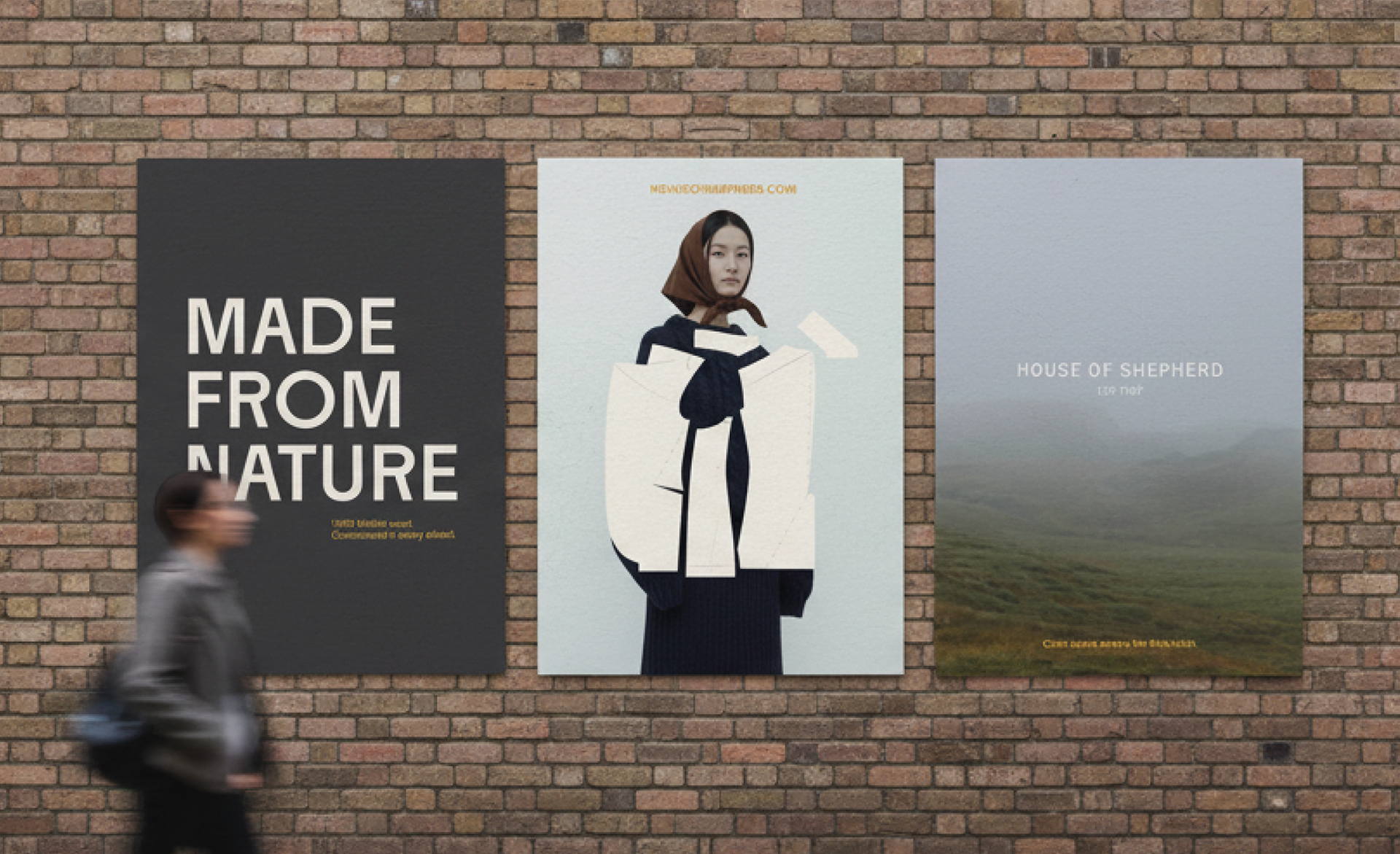
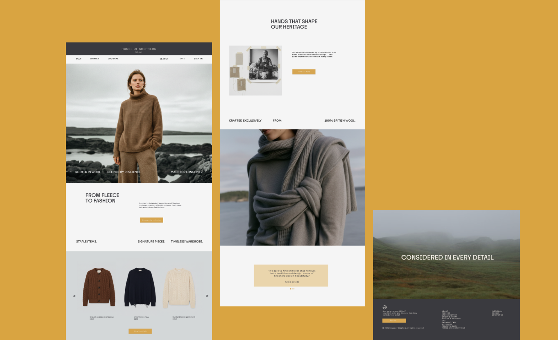
Pattern cutting became a storytelling tool. The shapes feel organic to reflect natural forms found in the landscape. The posters combine organic pattern shapes with strong, confident typography. The typeface was chosen for it is subtly irregular, echoing handmade processes while remaining contemporary.
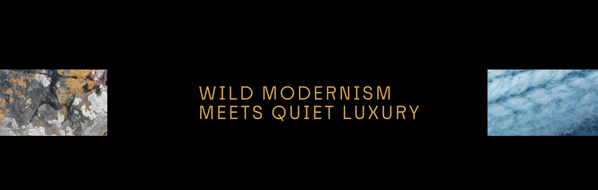
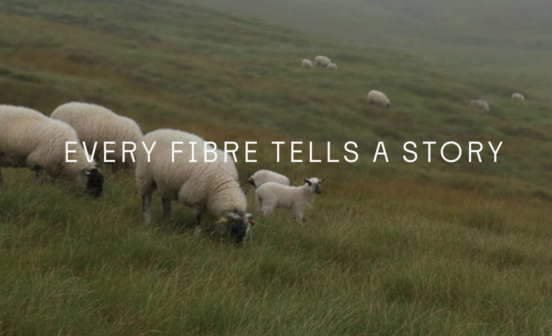
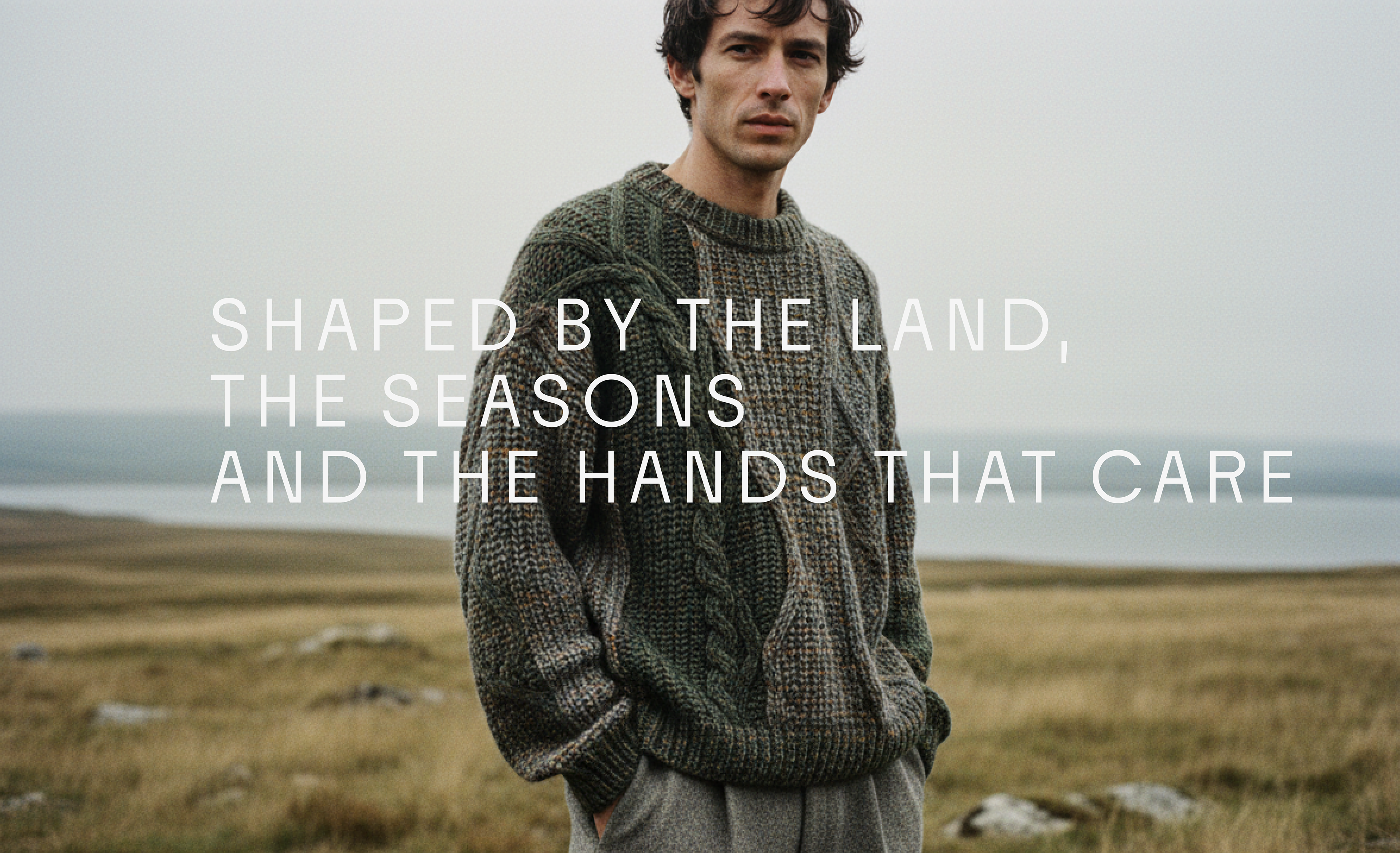
Motion was introduced to show qualities that static
imagery cannot - weight, softness, and how the knitwear moves.
imagery cannot - weight, softness, and how the knitwear moves.

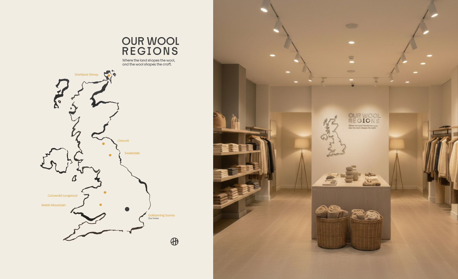
An opportunity to tell intimate storytelling moments within the shop.