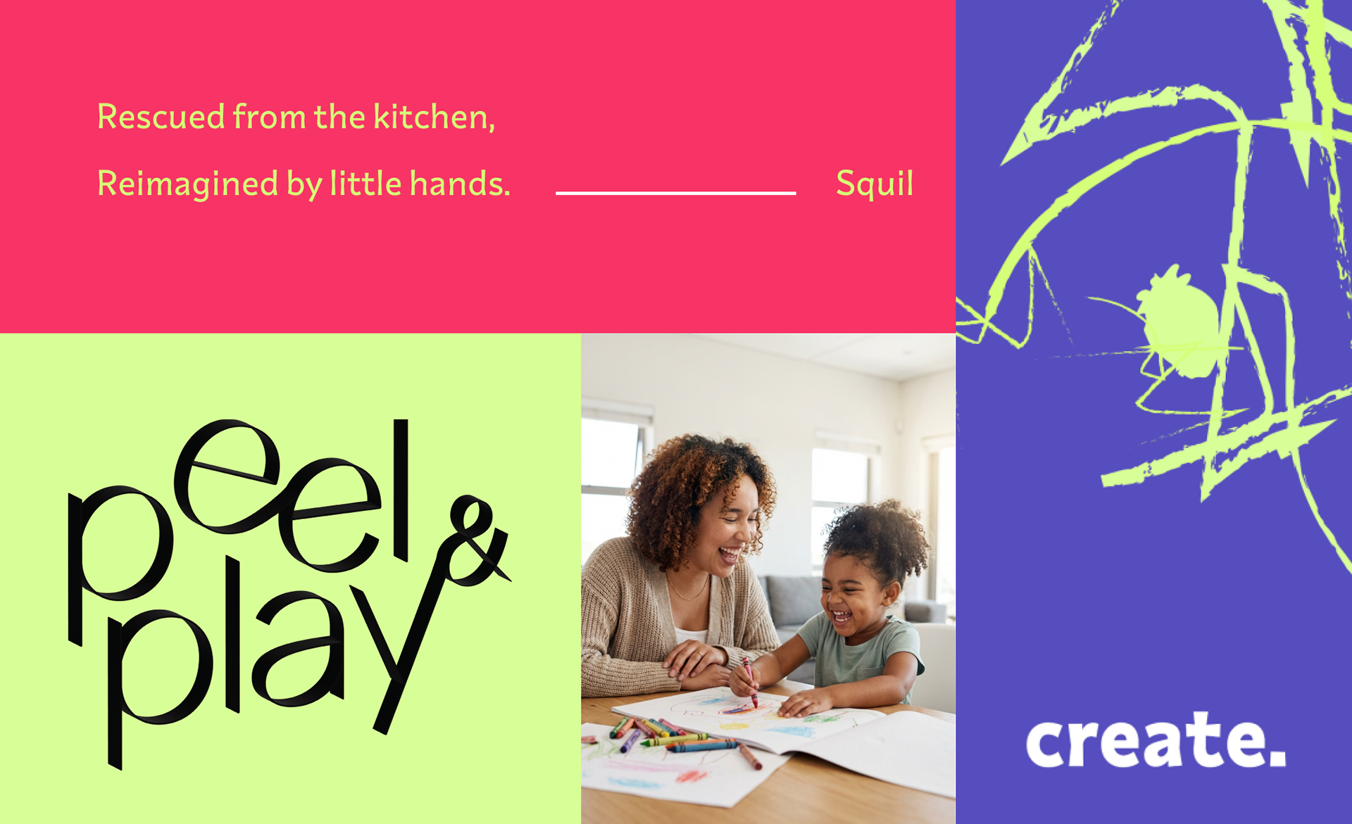
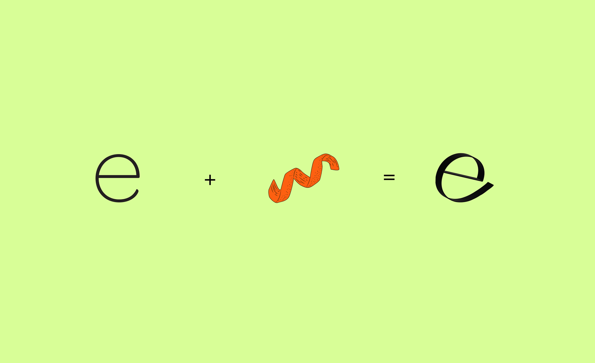
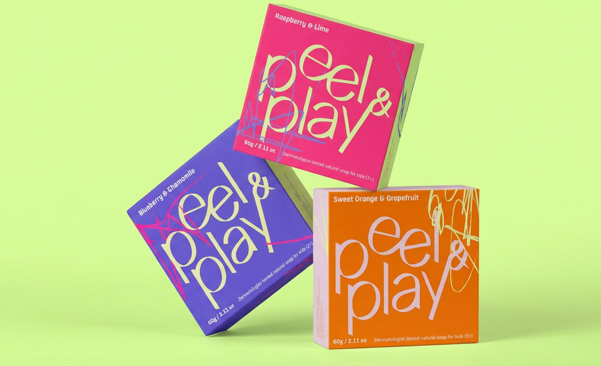
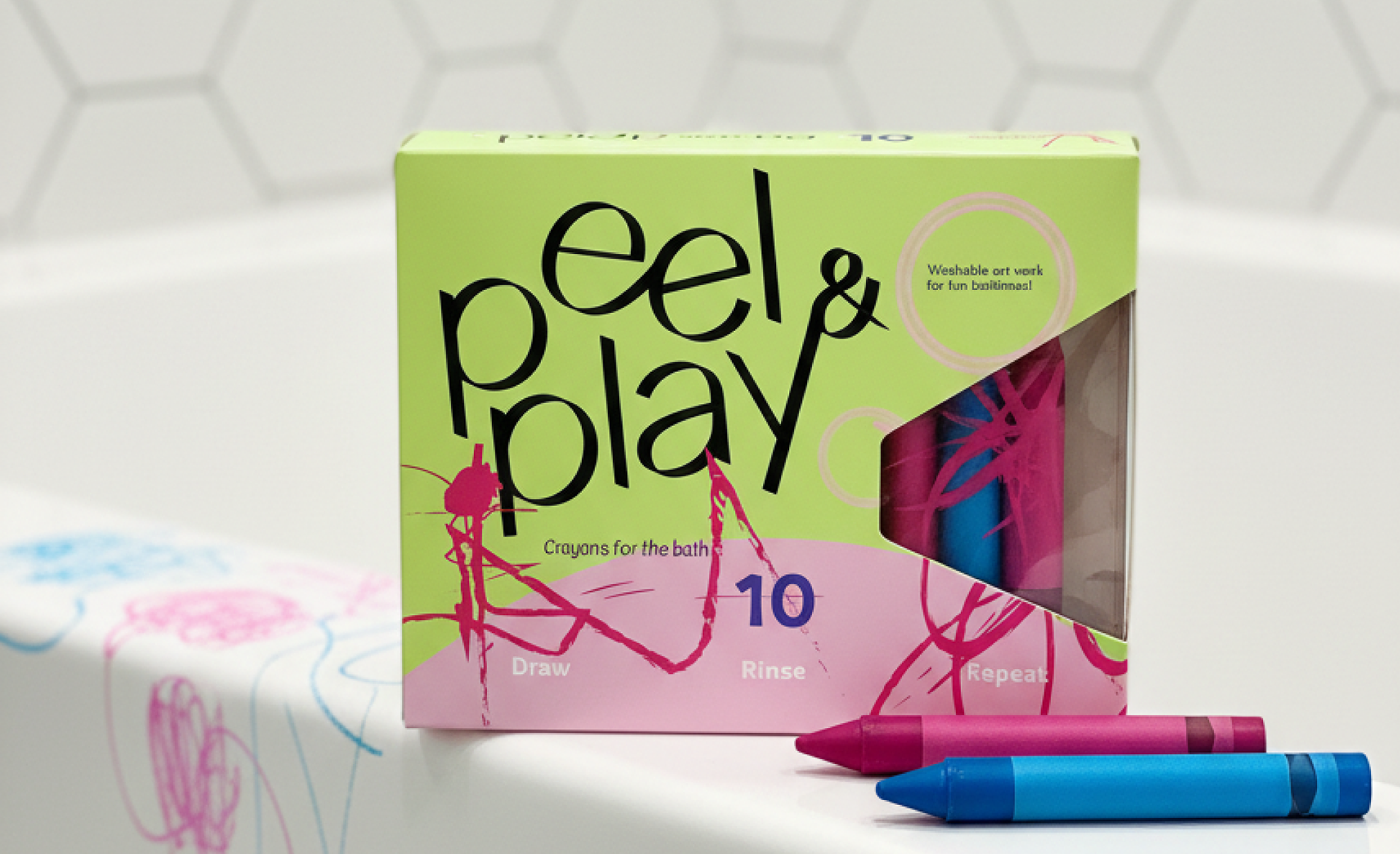
The bold colour palette is designed to feel joyful, energetic, and immediately appealing to children. The ‘e’ is inspired by the idea of an orange peel, subtly referencing fruit and play while keeping the mark simple and memorable.
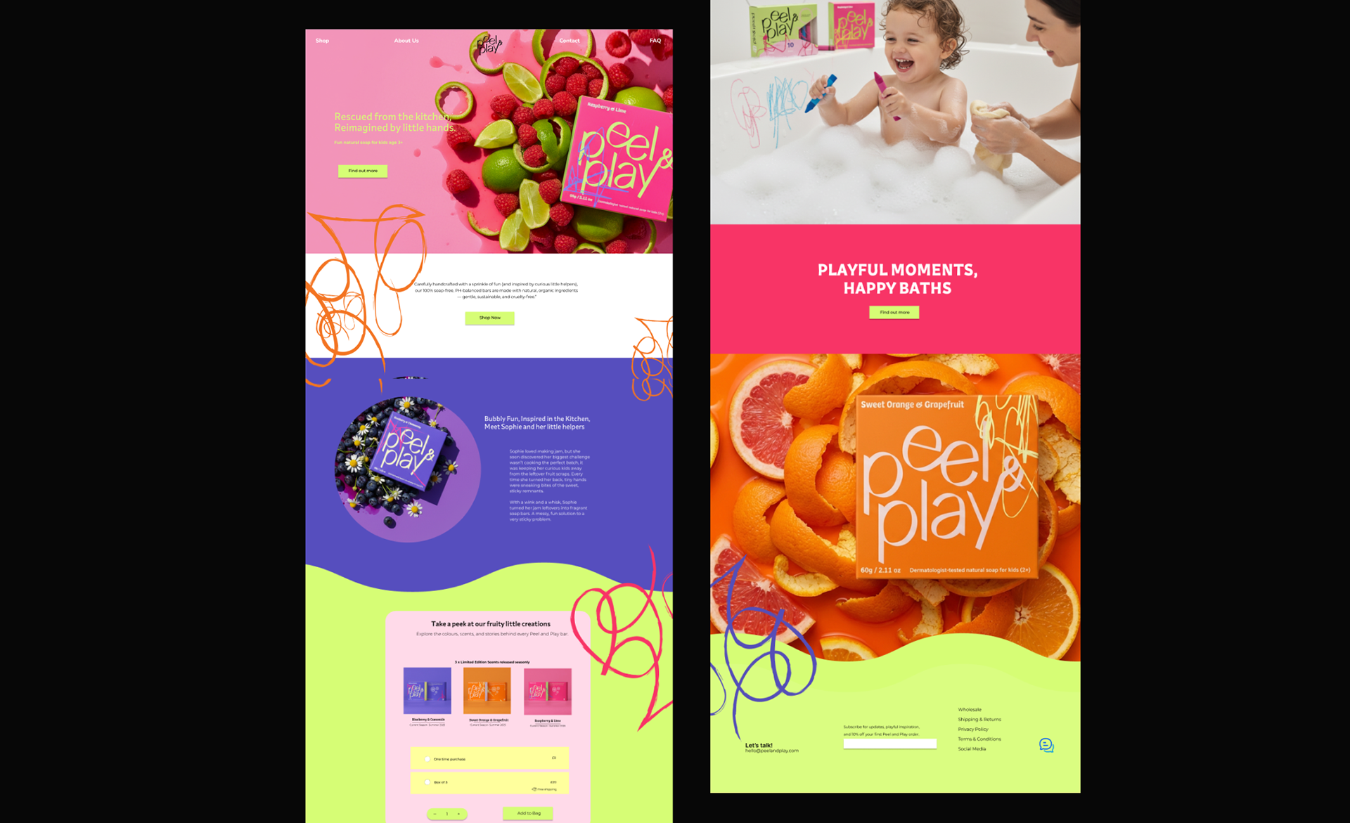
A snapshot of the website, giving an overview of how the brand
translates into a digital experience.
translates into a digital experience.
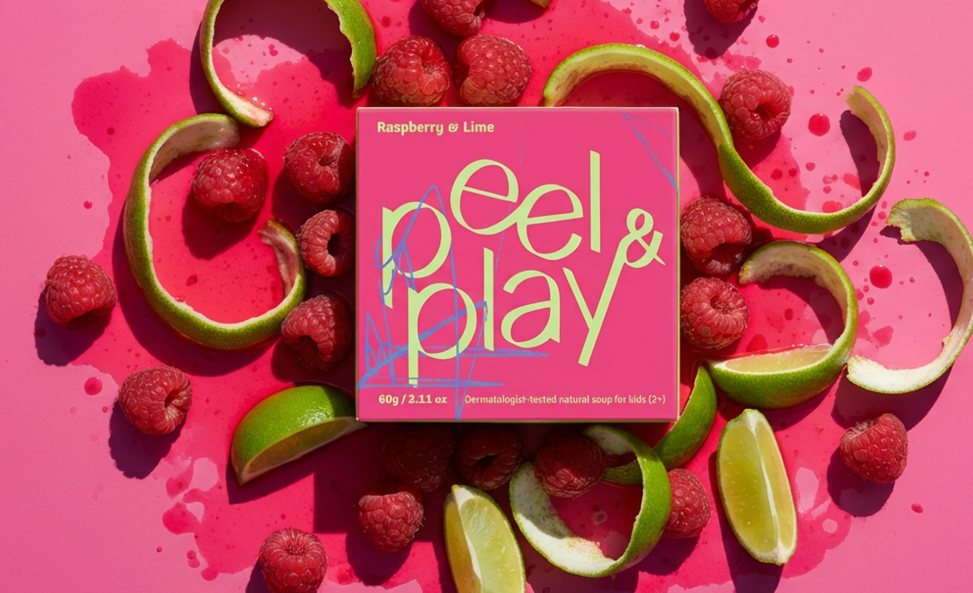
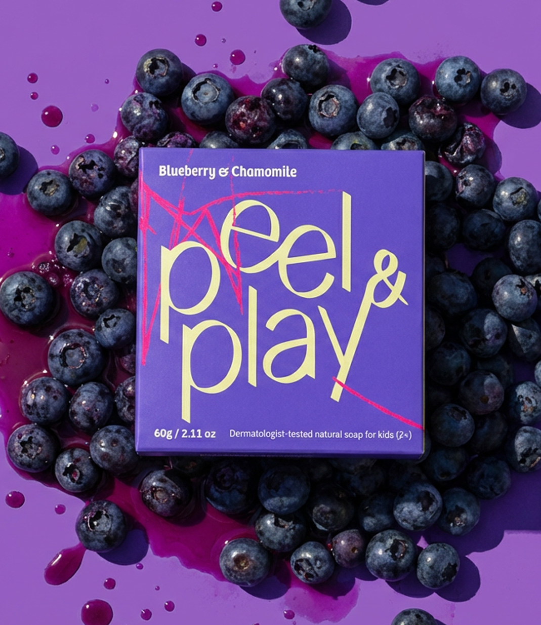
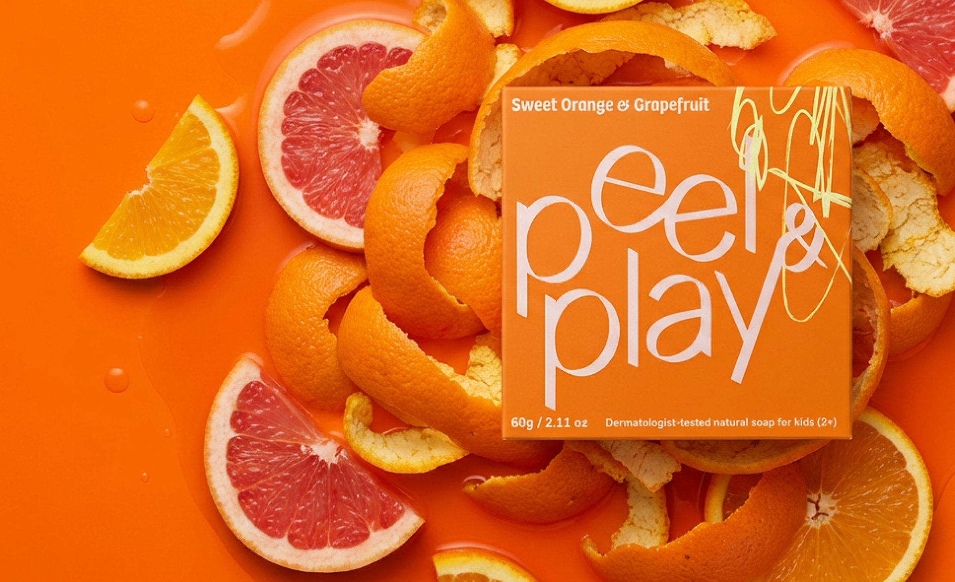
Art Direction concept - Placing the soap box among messy fruit reinforces
the brand’s core idea of embracing mess as part of the fun.
the brand’s core idea of embracing mess as part of the fun.
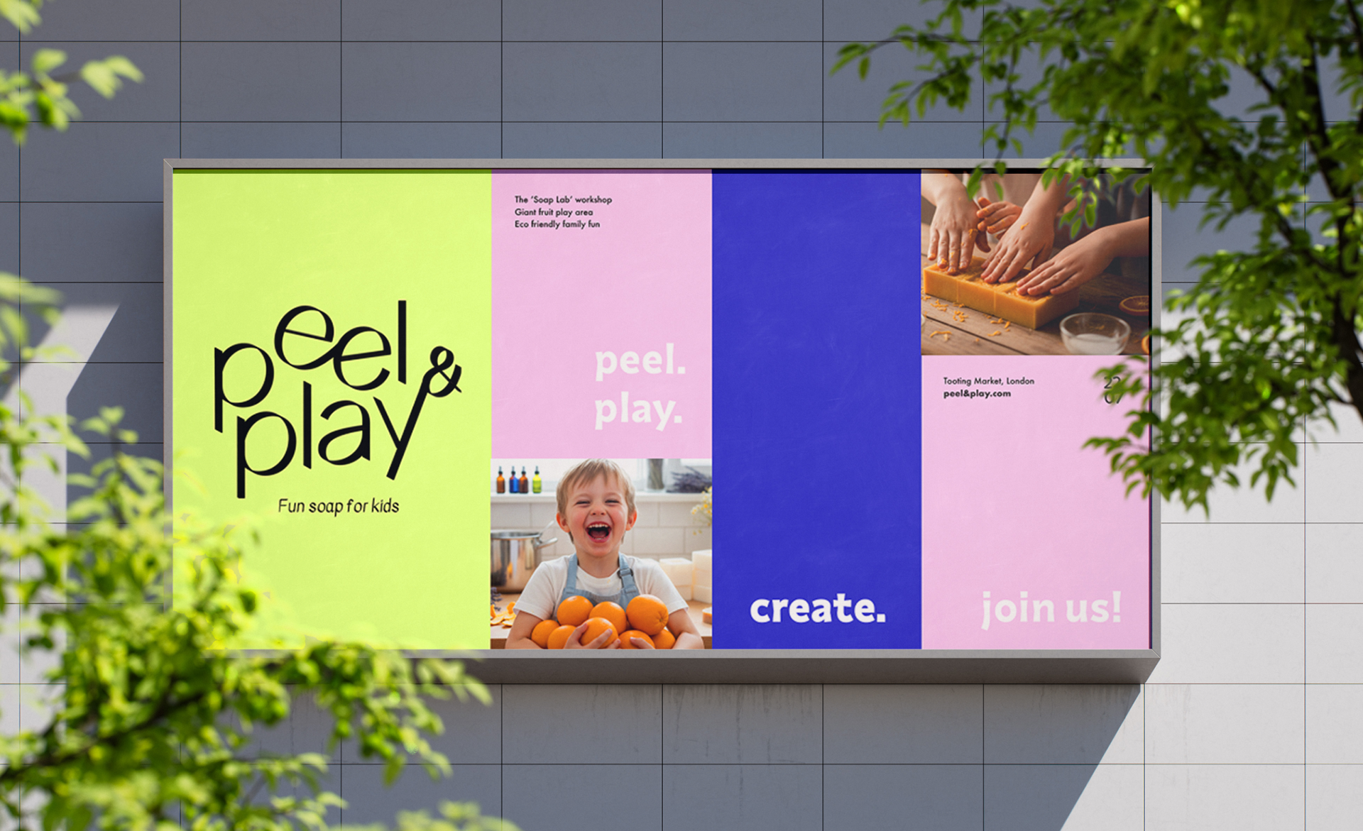
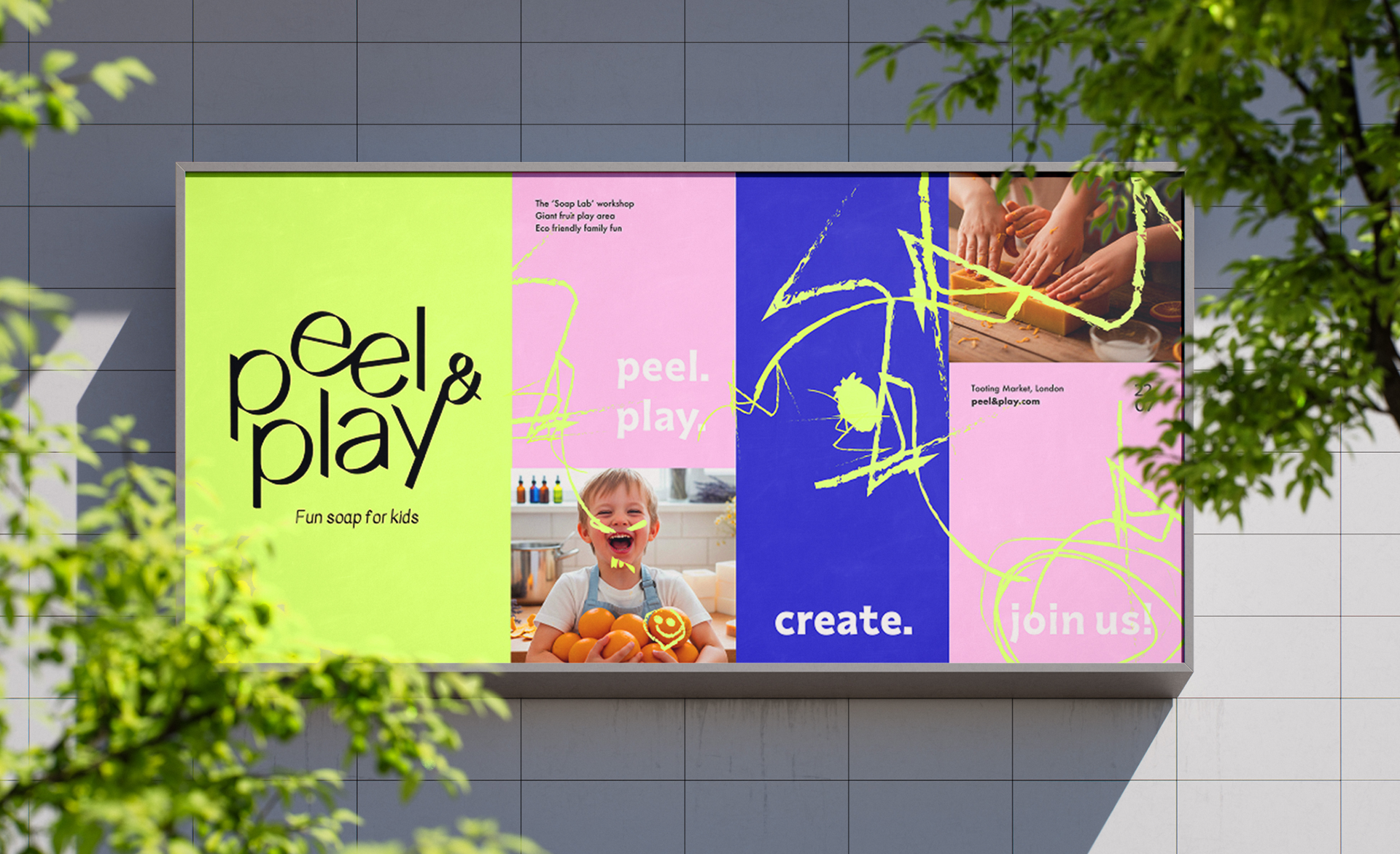
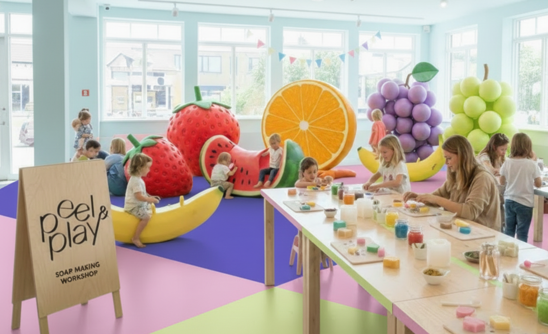
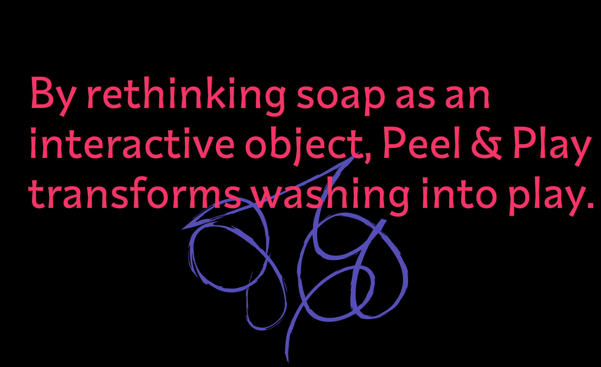
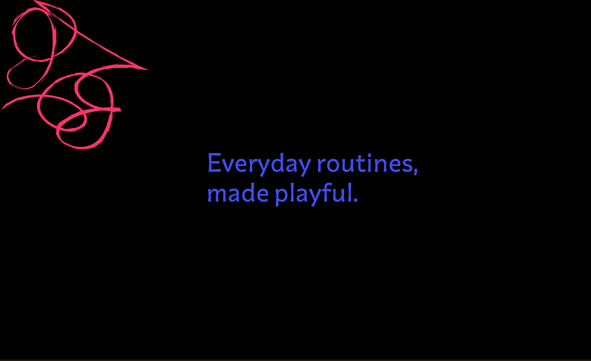
The scribble graphic is designed to animate across the billboard, bringing movement and playfulness to an otherwise static space. In this context, it advertises a peel and play soap making workshop.